

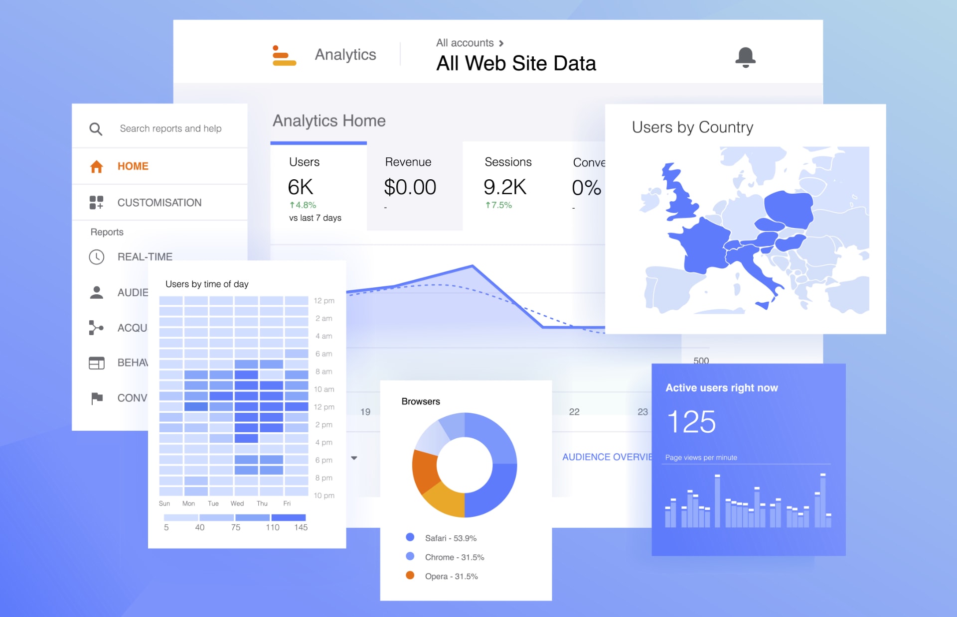
Ask most business owners whether their website is working and you get a feeling rather than an answer. It seems quiet. Enquiries were better last year. Someone said it looked good.
The information to answer it properly is already sitting in your analytics, and it is free. The trouble is that most guides to website metrics list twenty of them, which is how a busy owner ends up opening the dashboard once, feeling none the wiser, and never going back.
Five numbers will tell you what you need to know. Here is what each one means with no technical jargon, where to find it, and what a sensible figure looks like.
Before you start: the language changed
One thing to clear up first, because it explains why so much advice online no longer matches what you see on screen.
Google Analytics was rebuilt a few years ago, and the current version measures things differently from the one most articles were written about. Three changes matter for what follows.
The word conversion now belongs mainly to advertising. What used to be called a conversion inside your reports is now a key event, which Google defines as an action that matters to the success of your business. If you see an article telling you to check your conversions in Analytics, it was written for the old version.
Bounce rate has not disappeared, contrary to a claim you will see repeated everywhere. It still exists, and it is now simply the opposite of engagement rate. Engagement rate is the more useful of the two, for reasons we will come to.
Your menu may not match anyone else's. Analytics now arranges the report list down the left around the business objectives chosen when the account was set up, so a business chasing enquiries sees a Generate leads group while a shop sees Drive online sales. Accounts created before March 2023, or moved across from the old Universal Analytics, keep the previous arrangement of Acquisition, Engagement, Monetisation and Retention instead. The reports themselves are the same in both and carry the same names, so below we have named the report you want rather than the route to it.
If your reports look unfamiliar or nobody has set them up properly, that is worth fixing before anything else here will help. A website measuring nothing is a website you are running on instinct.
1. Key events: how many people got in touch
This is the number that matters most, and it is the one most businesses have never set up.
A key event is you telling Analytics which actions count. For most businesses that means a contact form being submitted, a phone number being tapped on a mobile, a quote request, or a booking. For a shop it means a purchase, and usually an add to basket as well.
Without this, your analytics can tell you how many people visited but not how many did the thing you wanted, which makes every other number decorative.
Where to find it: the Events report, grouped with the rest of your user engagement reporting, where events marked as key events are flagged. Ask whoever built or maintains your site to set them up if they are not there. It is a small job.
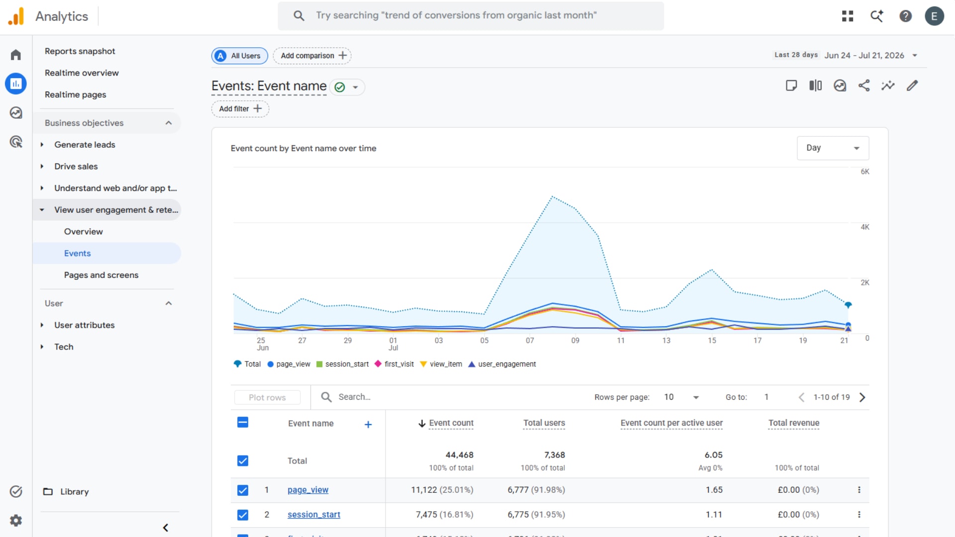
What good looks like: it depends entirely on your business, so the useful comparison is with yourself. Watch the direction of travel month on month rather than the absolute figure.
2. Engagement rate: are people staying or bouncing straight off
Engagement rate tells you what share of your visits involved someone paying real attention.
Google counts a visit as engaged if any one of three things happens: it lasts longer than ten seconds, it includes a key event, or the person looks at two or more pages. Anything else is counted as unengaged, which is what bounce rate now measures.
It is a more forgiving measure than the old bounce rate, and a more honest one. Someone who lands on your contact page, reads your phone number and calls you was never a failure, even though the old metric treated them as one.
Where to find it: the Traffic acquisition report, where engagement rate sits alongside your traffic sources.
What good looks like: compare pages against each other rather than chasing a benchmark. A page well below your site average is either attracting the wrong people or failing them once they arrive, and both are fixable once you know which.
3. Where your visitors come from
This is the number that tells you whether your marketing is working, and it is the one owners find most immediately useful.
Analytics groups your traffic into channels: organic search (people who found you on Google without you paying), direct (people who typed your address or used a bookmark), referral (links from other websites), paid, social, and email.
The value is in the diagnosis. A business with almost no organic search traffic has a visibility problem, not a website problem, and rebuilding the site will not fix it. A business with plenty of traffic and no enquiries has the opposite problem. You cannot tell these apart by feel, and treating one as the other is how money gets wasted.
Where to find it: the Traffic acquisition report again, alongside the User acquisition report that sits with it.
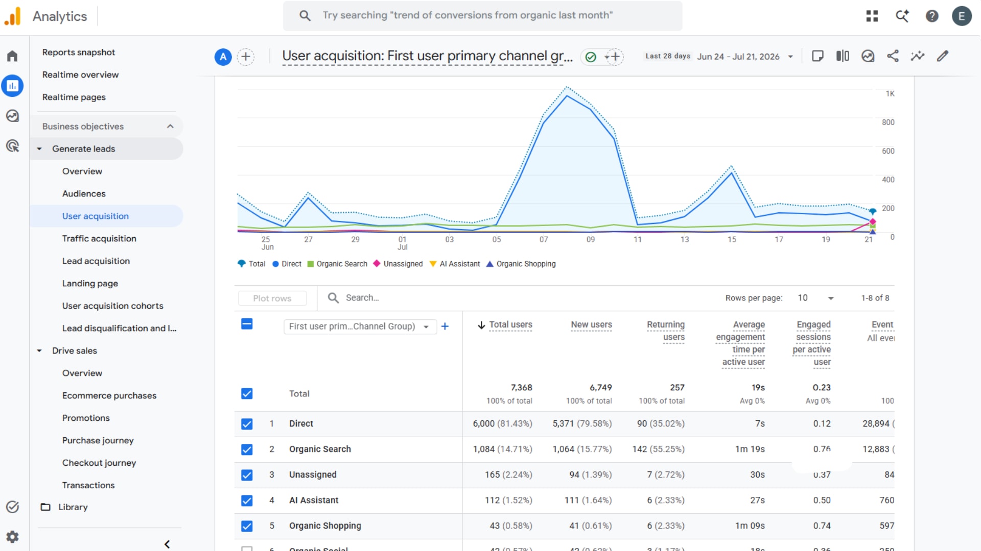
What to watch for in 2026: Google added a new channel this year for traffic arriving from AI assistants, which appears with a medium of ai-assistant. It is a new line on the report, and for the first time it lets you see how many customers reached you after asking an AI rather than searching. For most businesses the numbers are still small, but Contentsquare's 2026 benchmark found that traffic referred by AI converts at 1.3% and has grown 55% year on year, so it is worth knowing whether yours is climbing.
4. Which pages bring people in
Most owners assume the homepage is where visitors arrive. For a site with any search visibility at all, it usually is not.
Landing pages are the pages people enter your site on, and the list is often surprising: a blog post from two years ago, a service page nobody has updated, a location page you had forgotten about. These are your real front doors, and they deserve the attention the homepage usually gets.
Two things to do with this list. Look at the pages doing the most work and make sure each one has an obvious next step, because a page that attracts people and then offers them nothing is a leak. Then look at the pages you expected to see and cannot find, because that gap is usually a search visibility problem worth investigating.
Where to find it: the Landing page report, grouped with your other user engagement reports.
5. Mobile against desktop
The last number is the one businesses most often have never looked at, and it is frequently where the biggest problem is hiding.
Analytics will split every other metric by device, and the split usually tells a story. Contentsquare's 2026 benchmark, drawn from 99 billion sessions across more than 6,000 sites, found that desktop converts at 3.4% against 2.0% on mobile, which makes desktop conversion around 74% higher. The same research found visitors spend 4 minutes 46 seconds per session on desktop against 2 minutes 20 seconds on mobile.
Some of that gap is normal behaviour, because people browse on phones and buy at a desk. But if your own gap is dramatically wider than that, the mobile experience is losing you business, and the cause is usually something you would never notice on the machine your website was built on.
Where to find it: the Tech details report, under User, or add device as a comparison to any report.
What good looks like: a mobile figure meaningfully worse than the benchmark gap is a flag. Open the site on your own phone, on mobile data rather than office wifi, and see how it feels.
How often should you look at these?
Monthly is right for most businesses. Weekly is usually noise, and quarterly is too slow to catch a problem while it is still small.
One newer feature makes this easier than it used to be. Analytics now generates a short summary on its home page highlighting the main changes since your last visit, which is a reasonable starting point for anyone who finds the full reports intimidating.
What matters is consistency rather than depth. Five numbers, once a month, compared against your own previous months, will tell you more than an annual report full of charts nobody reads.
What the numbers cannot tell you
Worth being straight about the limits. Analytics tells you what happened, not why, and it will not tell you that your homepage fails to explain what you do or that your photography undermines your credibility. Those judgements still need a human eye.
It also cannot tell you about the enquiry that came by phone because someone found you on Google Maps, or the customer who saw your site months ago and only got in touch now. Not everything that works is measurable, and treating the dashboard as the whole truth leads businesses to cut the things that quietly bring in work.
Used properly, these five numbers do something more modest and more useful than a full report. They tell you which half of the problem to look at, so that when you do spend money on your website, you are spending it on the right thing.
If the numbers suggest something is wrong but you are not sure what, the signs worth checking will help you narrow it down, and if the answer turns out to be the site itself, refresh or rebuild covers what to do about it.
Want a second opinion on your numbers?
If you would rather someone looked at this with you and told you plainly what it means, get in touch and we will go through it, or see how we approach web design.
Related Posts



Get in touch - we're happy to chat.